
Design, user experience and aesthetics are true for software, websites and social media in the same way as human interactions between people. Beauty, while not being tangible is in fact a real perception. Most of the decisions we make in life are based on how we feel about something, of someone. The visual appeal is are very important part.
For this reason, we're going to look into the color theory in design.
Let's start with a couple of definitions:
Color: The visual perceptual property corresponding in humans to the categories called red, yellow, blue and others.
Hue: An identification of a color relative to some other color. A hue is an element of the conventional color wheel or circle that consists of all colors that are contained within the circumference formed by the longest wavelength at one end and the shortest at another.
Color temperature: Color temperature is a characteristic of visible light that has important applications in lighting, photography, videography, and other imaging sciences, also sometimes in physics. Color temperature is conventionally stated in the unit of absolute temperature, the kelvin, having the unit symbol.
Tint, Shade, Tone : To change some aspect of a hue so as to produce something related but different—typically by adding white or black or gray or changing its value relative to lightness or darkness.
Saturation : The degree of chromatic intensity perceived in a specific color, adding gray to it.
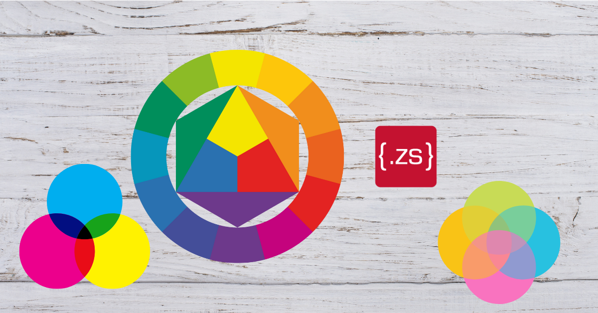
Color wheel : A color wheel or color circle is either:
1) An abstract illustrative organization of color hues around a circle, that show relationships between primary colors, secondary colors, complementary colors, etc., according to some particular color model.
2) A physical artifact that represents colors as they are related according to some color model. The traditional common designations are red, yellow, green, blue and purple/violet into the intermediate triangle; orange/amber and scarlet / coquelicot into the adjacent but different-looking areas; and rose / pink and turquoise / cyan into the third area created beyond this by connecting lines on one side of the most "usual" colors.
It goes beyond this, and into psychology as well.
